Syrenna
TEAM:
Charlotte Sverdrup (UX/UI)
TOOLS:
Figma, Figjam, Airtable
Syrenna (the latin word for mermaid) was founded in 2022 by Alex Alcocer, Becky Wightman, and Ester Strømmen. Their WaterDrone is aimed at helping the Offshore Wind Farm market monitor ocean data before, during and after installations of wind turbines and provide valuable insight into the industries’ effects on our oceans.
Currently the Ocean Windfarm environmental impact assessment manager’s have to use other resources (ie. vessel with crew) to get valuable ocean data because they lack the tools to help them make this easier. The problem is both time consuming and costs money.
The Challenge
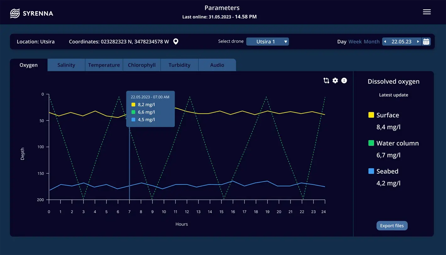
The client requested an aesthetically pleasing, user-friendly dashboard featuring a full-screen map view of drone locations as the landing page. The dashboard should allow users to easily view headline information, interact with plotted graphs, and download data as needed.

Solution
A map overview and layered parameter pages were designed to allow users to select the number of parameters they wish to monitor without impacting the layout.


Design process
Applying the design thinking process, I conducted primary and secondary research and facilitated user testing to gather valuable feedback and refine the solution.
User testing
A moderated remote user test was conducted with experts in ocean data, yielding valuable insights that informed the dashboard’s next iteration. Key findings included:
-
Most participants prioritized the alert banner on the map, clicking it before exploring other elements.
-
Participants requested additional details in the diagrams, such as the time, depth of drone measurements, and proximity to the mooring, as well as the depth of the seabed.
-
All participants found the dashboard intuitive and user-friendly.


